Website Design for Positive Promotions
This project was to refresh the Positive Promotions website, positioning the brand as modern and professional with an upbeat vibe. The primary goal was to establish and strengthen the online brand identity by coordinating visual elements, organizing information clearly, and making select functionality improvements. This project included developing an online style guide defining a color palette, fonts and treatment for links and buttons.
CLIENT:
Positive Promotions, a business offering a variety of top-quality personalized promotional items to the Education, Healthcare, Public Safety and Corporate marketplace
SKILLS:
Wireframing
User Experience
Design
Page Layout
Illustration
SOFTWARE:
Photoshop
Illustrator
Site Header
The header was designed to encompass the new online brand identity. The shopping cart tab is emphasized and balances out the logo as primary focal points. The main navigation is highlighted in a baby blue to give it visual presence and define the header area.
Per the clients request, space for promotional messaging was added along the top of the site and important links were inserted below the main navigation. Modern icons were created for the customer service links and information to help them stand out.

Site Footer
The footer was revamped beginning with adding a section for Positive Promotion to feature upcoming events that are important to their target market. A high-contrast blue bar is used to emphasize the contact information and email sign up form.
The footer links were reassigned to four, new, intuitive category headings and a section was constructed to highlight the most important links in an orange font. A space centered at the bottom of the page was established for social media links, which are branded in vibrant orange.

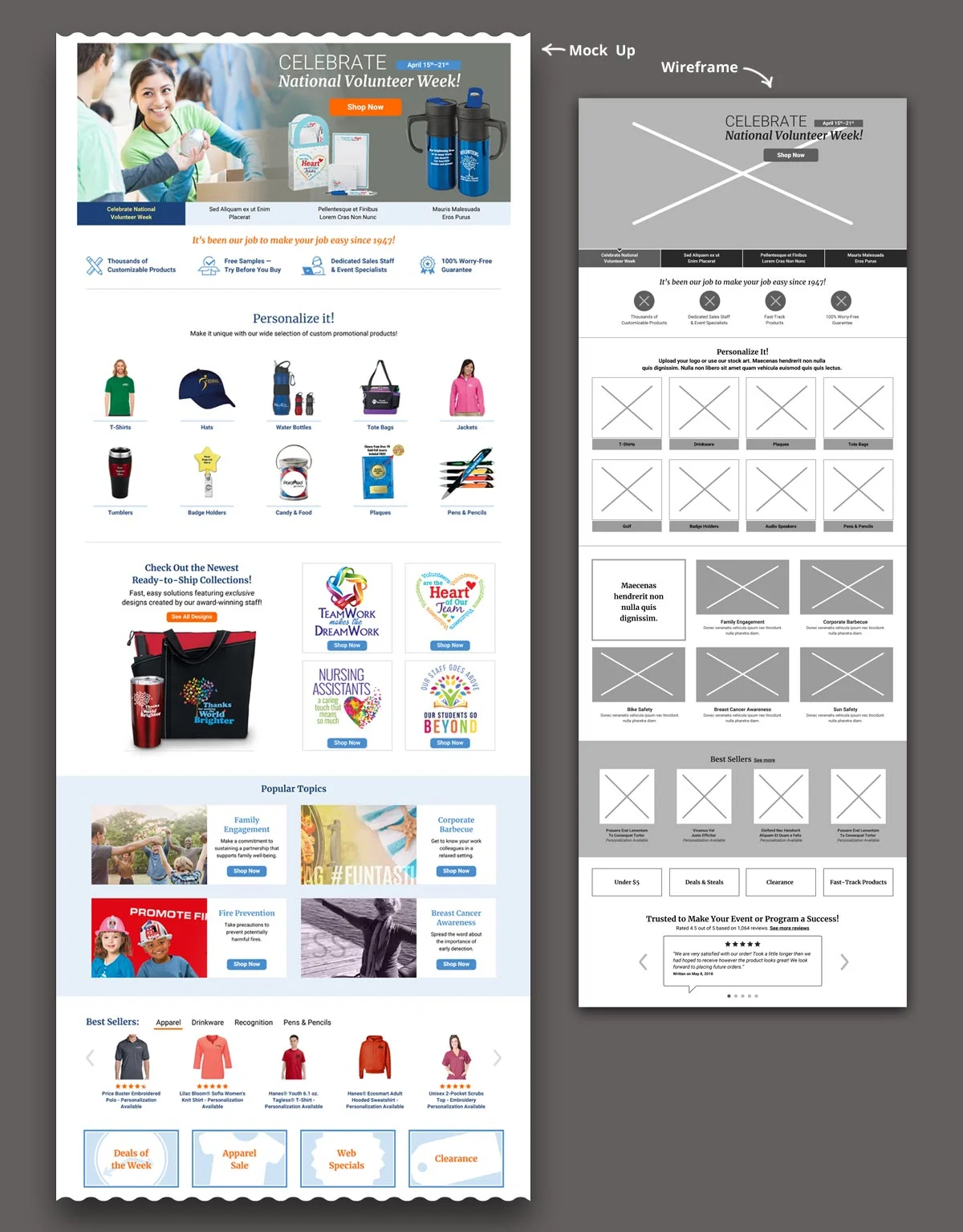
Homepage
There was considerable room for improvement to the merchandising and marketing efforts on the homepage. The feature slider was kept as requested by the client to provide messaging to its various markets. Thumbnail graphics were replaced by text, which would be more insightful for customers.
Below the feature is an area to build shoppers’ confidence and present the business’ unique selling points. Included is their longevity, free sample program and customer service expectations.
The most substantial enhancements to the homepage are the next two sections. The first presents links to the business’ core product lines. The second displays unique artwork on their turnkey, ready-to-ship solutions—a product offering that sets them apart from competitors.
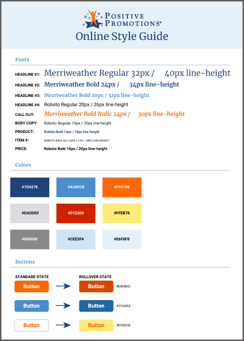
Fonts & Colors
The color palette was chosen for colors that are perceived to be professional and vibrant. These colors can be characterized as saturated in nature. Previous versions of the website and logo frequently utilized various shades of blue. For this reason, an dark royal blue was selected as the base color. It was paired with a dynamic orange for a pop of color and energy.
The color palette is rounded out with a vibrant azure and a light baby blue; a modern, clean gray in two shades; a brilliant yellow that would contrast well against the royal blue; and a luminous red to depict key information.
Since the the logo uses serif and the business has roots in publishing, it only made sense to use a serif as the primary font. In this case, Merriweather was selected for its perfect balance of a timelessness and open, airy nature. It was paired with Roboto for its clean modern lines.